In Our Element Pursuing Coffee
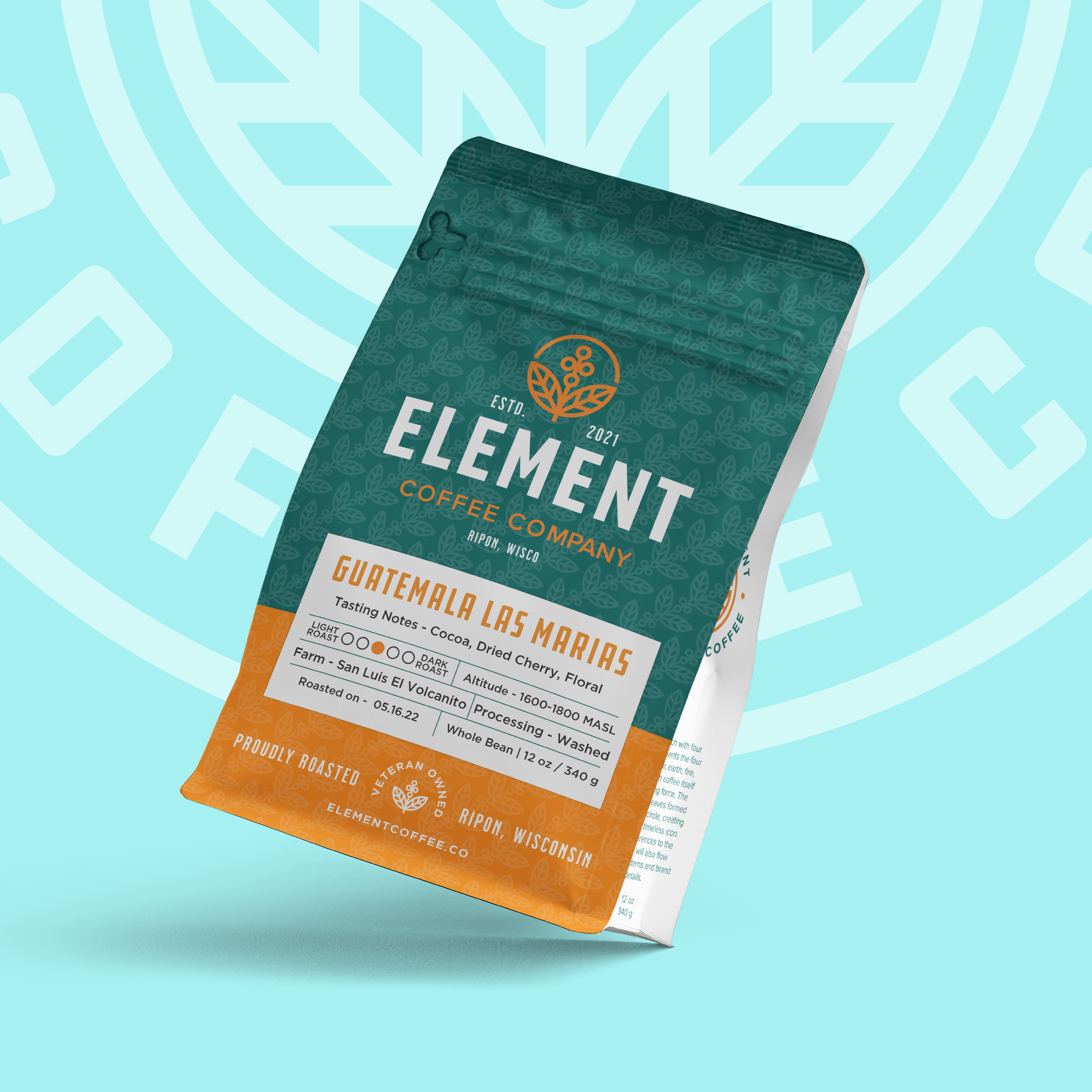
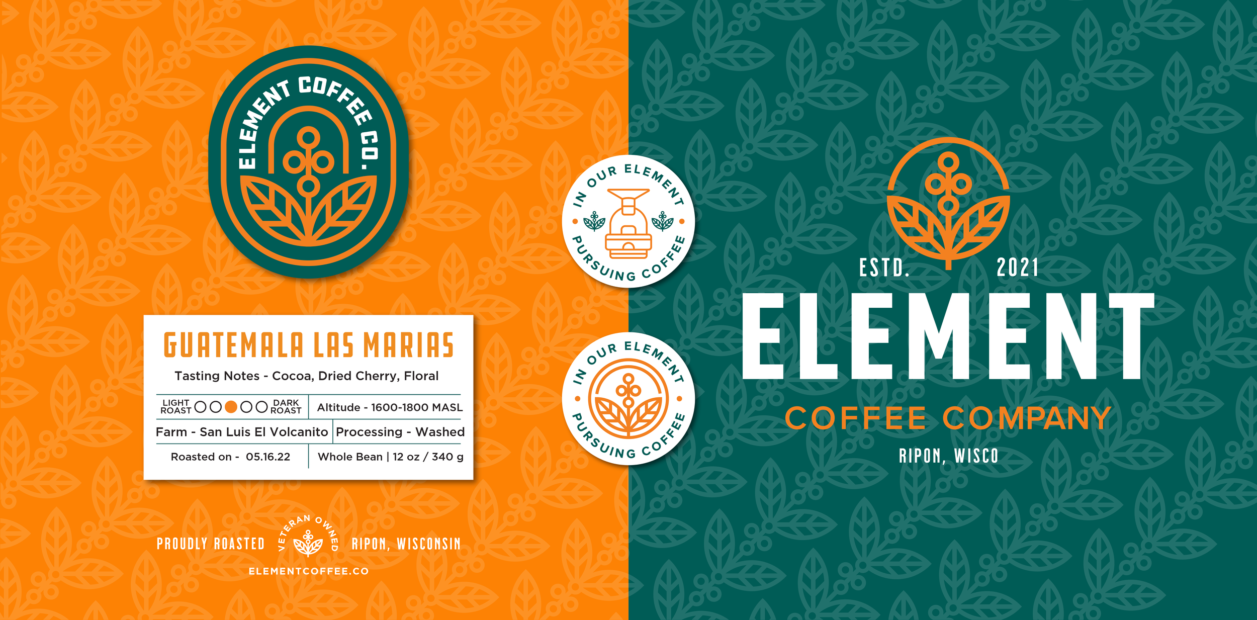
I had the pleasure of working with Matt from Element Coffee Co. to craft a logo that captures the unique spirit and passion they put into each of their roasts. If you know us you know we LOVE coffee here at Ink Signals. Jesse co leads a monthly coffee club, its serious. So we were stoked to get to work on this one! Element is a blend of premium coffee with a playful, relaxed yet bold vibe, roasted by the nicest, funniest, and genuine guy in Ripon, WI.
The goal of this collaboration went beyond just a logo; it was about channelling Element’s ethos into a visual identity that feels profesional, illustrative, and top-quality. A mark that combines both symmetry and coffee elements, this logo embodies the lively character of Element Coffee Co becoming a memorable and distinct mark in the competitive specialty coffee landscape.
Project Scope:
— Logo System
— Brand guidelines
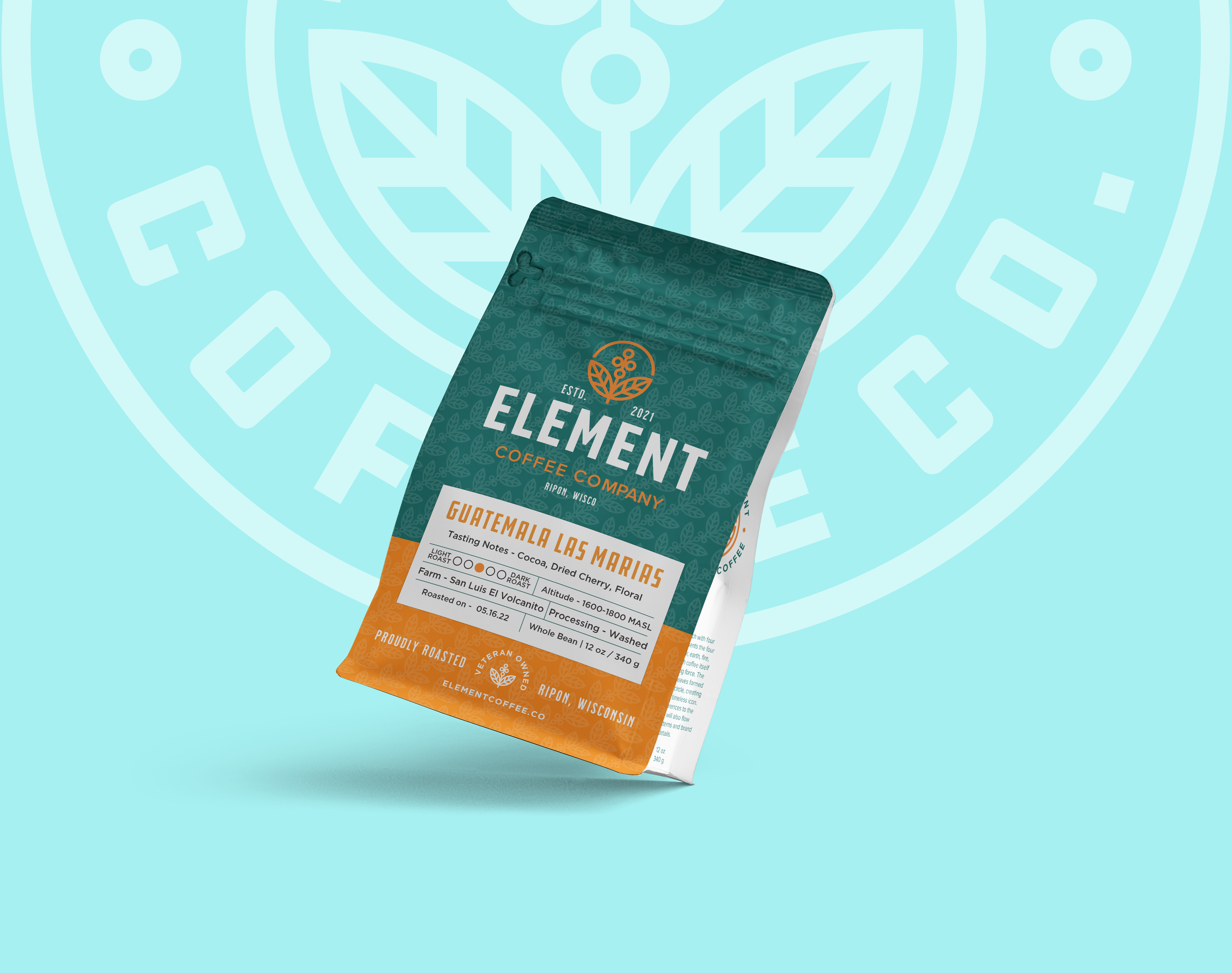
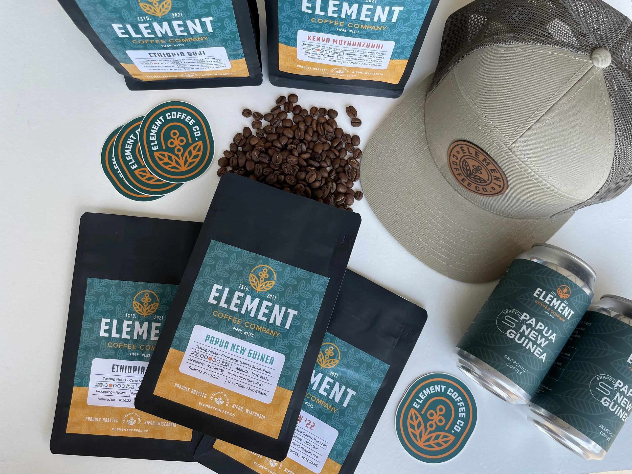
— Packaging Design
— Type & color system
— Collateral: Labels, Signage, Stickers, Business Cards
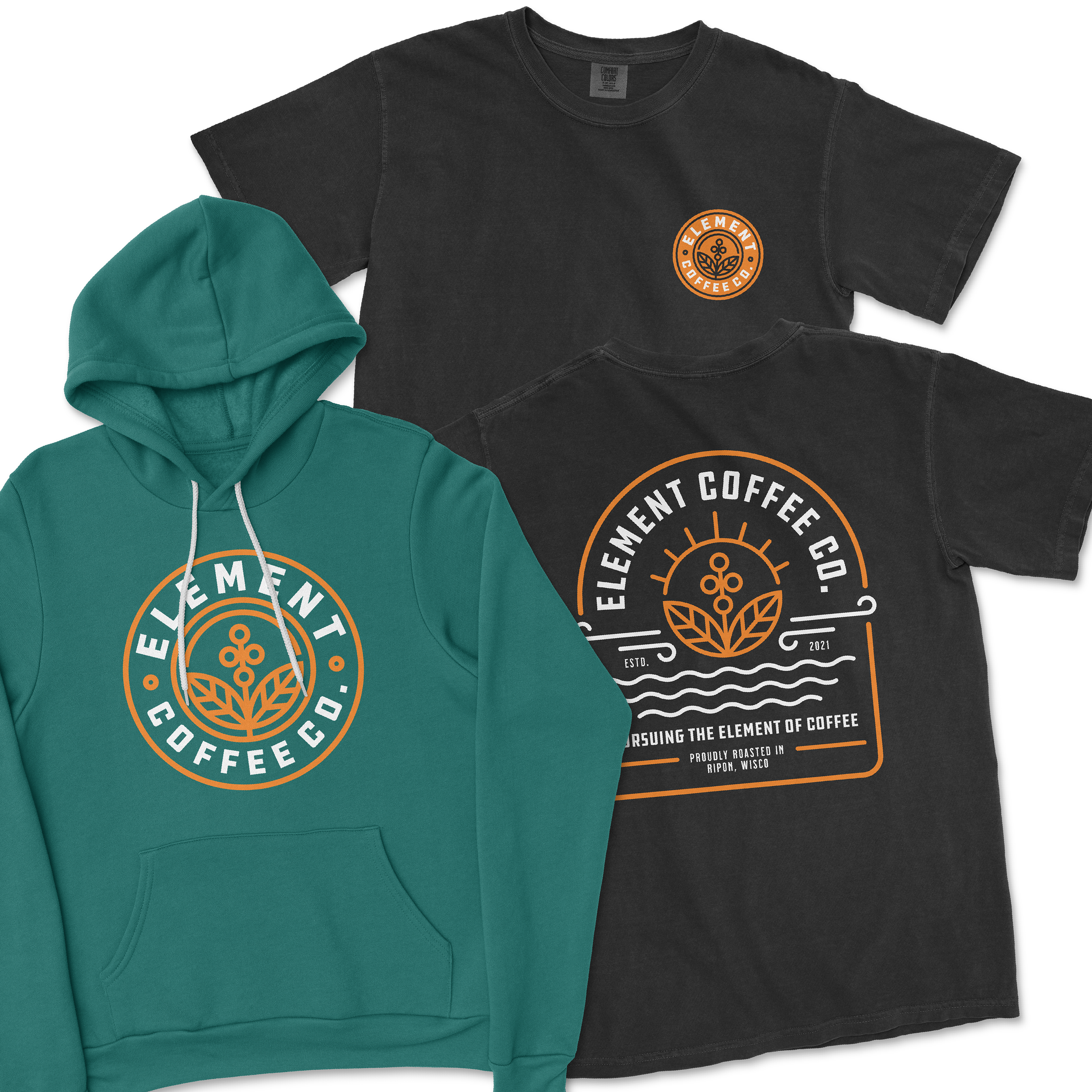
— Apparel / Merch Design & Printing
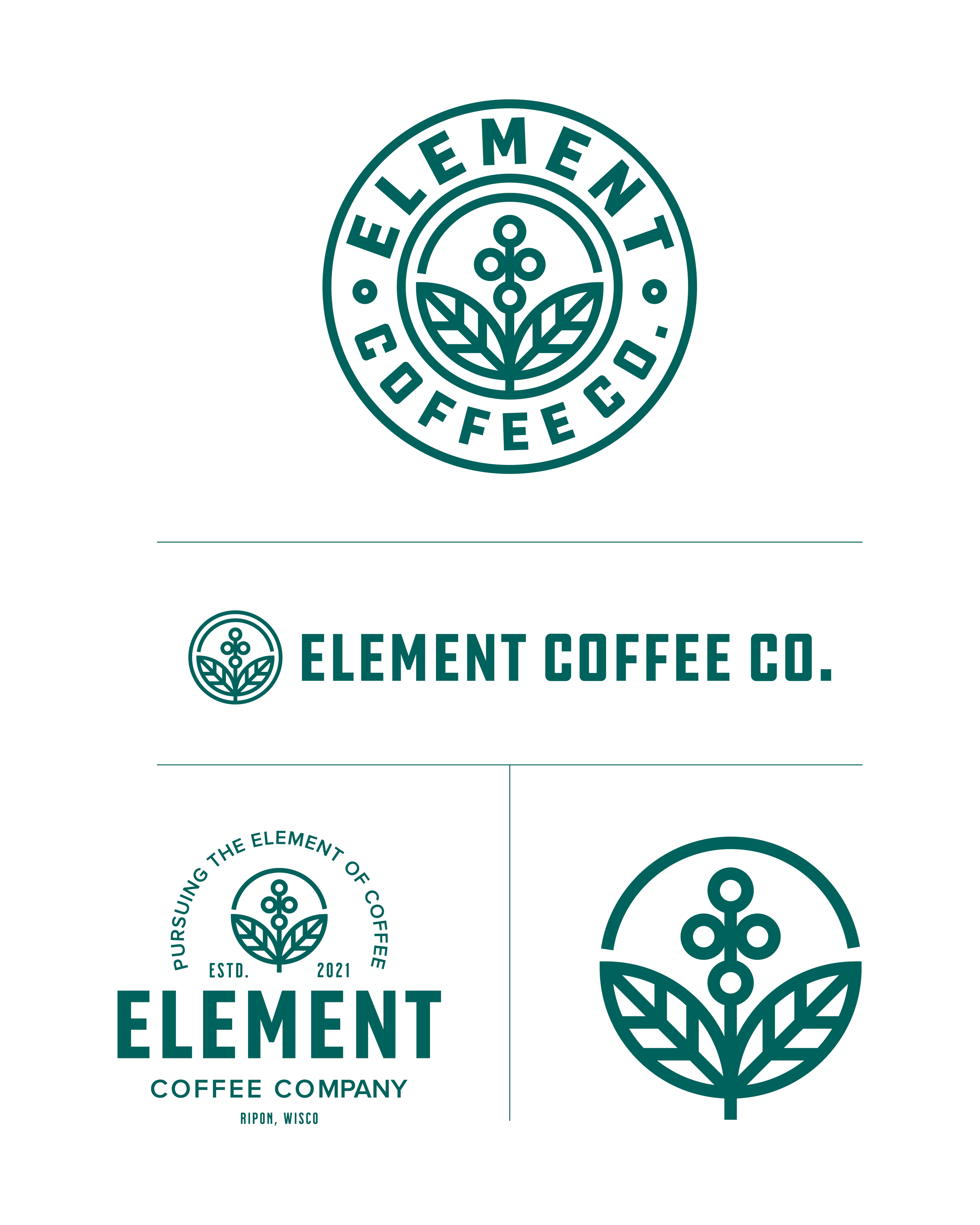

Behind the Logo
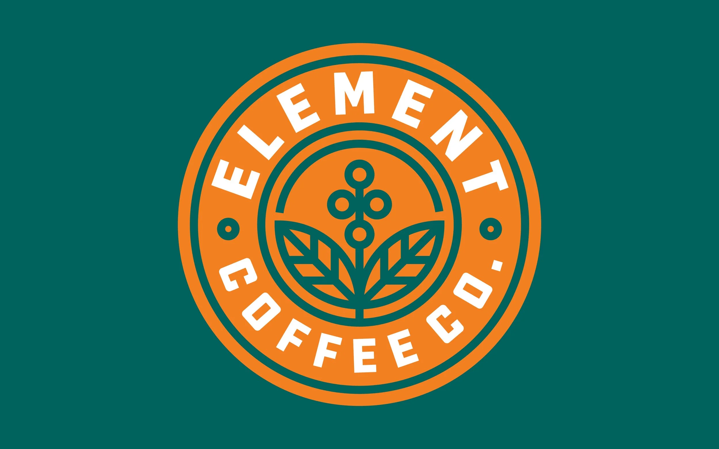
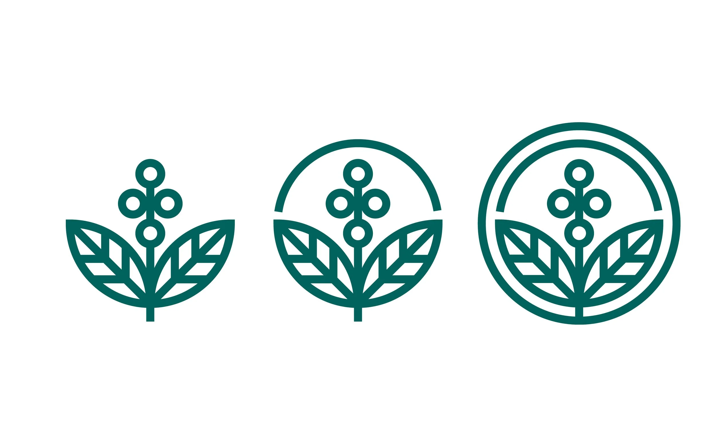
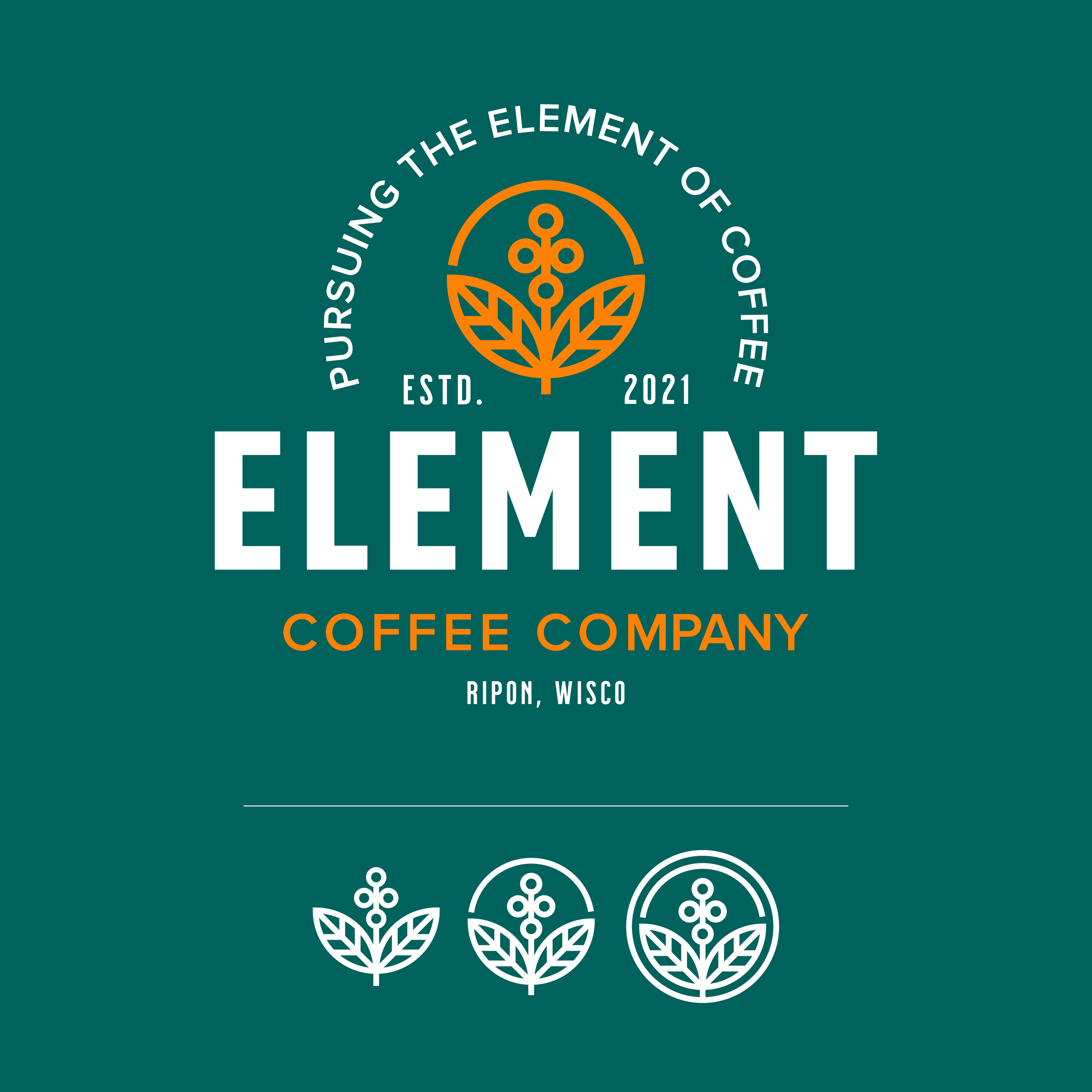
Coffee Branch
Symmetrical
4 Cherries
A coffee branch with four cherries represents the four elements —air, earth, fire, and water, with coffee itself as the unifying force. The symmetrical leaves formed from a clean circle, creating a balanced, timeless icon. Subtle references to the elements will also flow through patterns and brand details.
Pursing The Element Of Coffee
Built with symmetry in mind.