Foundation Woodworks
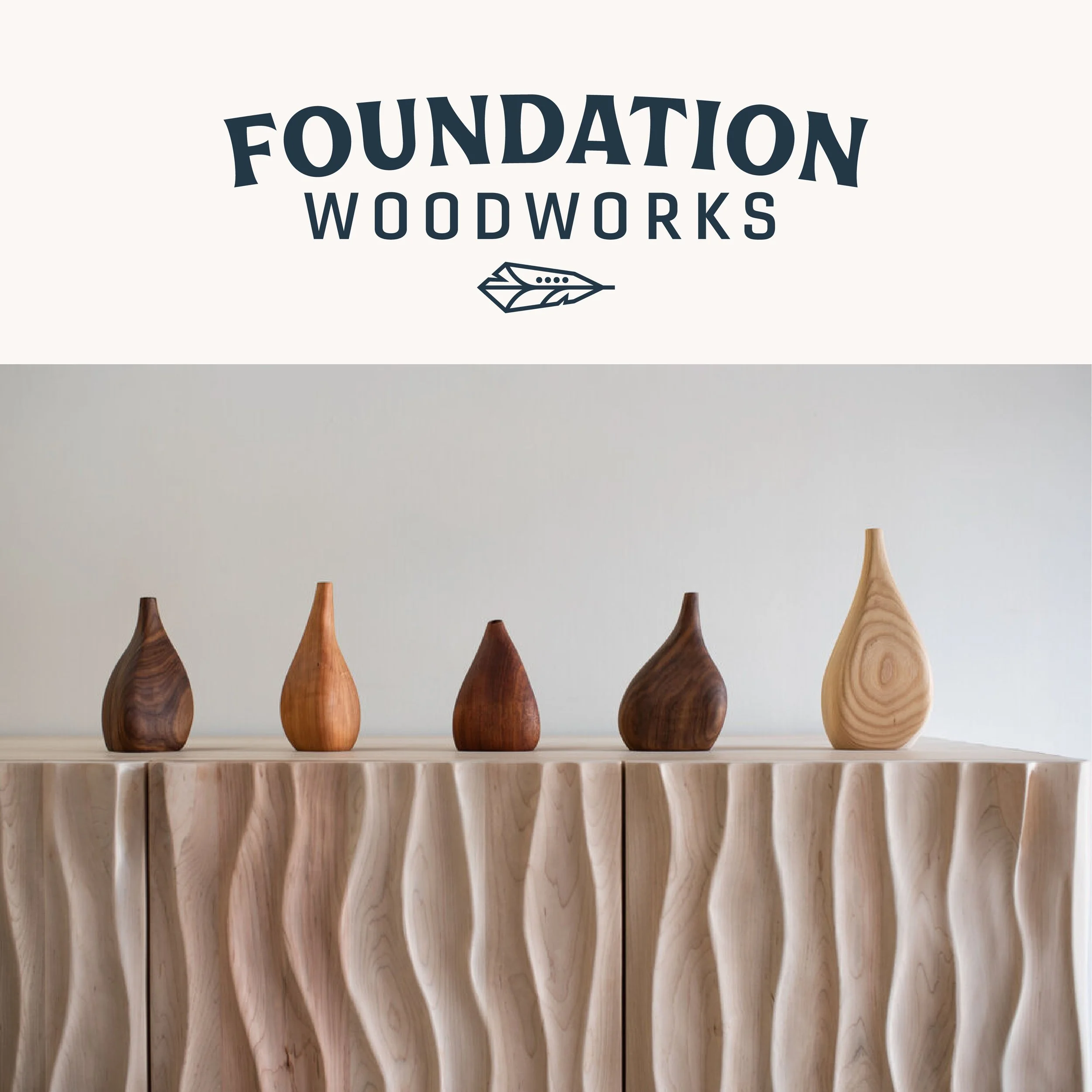
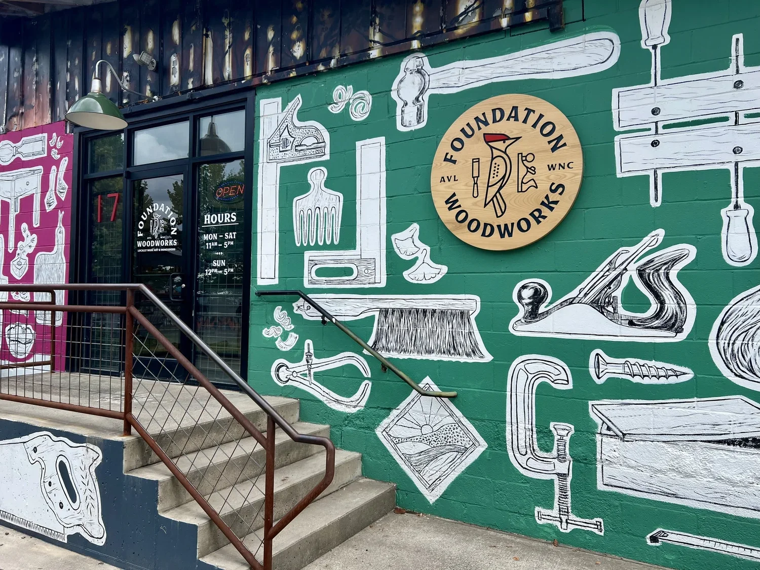
I had the pleasure of working with Mark and Jacqueline from Foundation Woodworks on their new branding. They had recently purchased Foundation Woodworks a gallery and community woodshop in the historic River Arts District of Asheville, North Carolina, dedicated to highlighting and advancing the art of woodworkers and craftspeople in that mountain region. They showcases a wide array of fine woodworking from more than 65 local artists. Turned bowls, wall sculptures, homegoods, jewelry, lighting, woodcut prints, kitchenware, cutting boards, and a varied selection of heirloom-quality furniture are all featured there. They also provide a community woodshop to 20 local woodworkers who rent out studio / work space.
They inherited branding that in their words, was “terrible and confusing” and wanted a brand that at a glance people can recognize who they are and what they offer instead of being confused. They want a sense of professionalism and consistency between signage to socials.
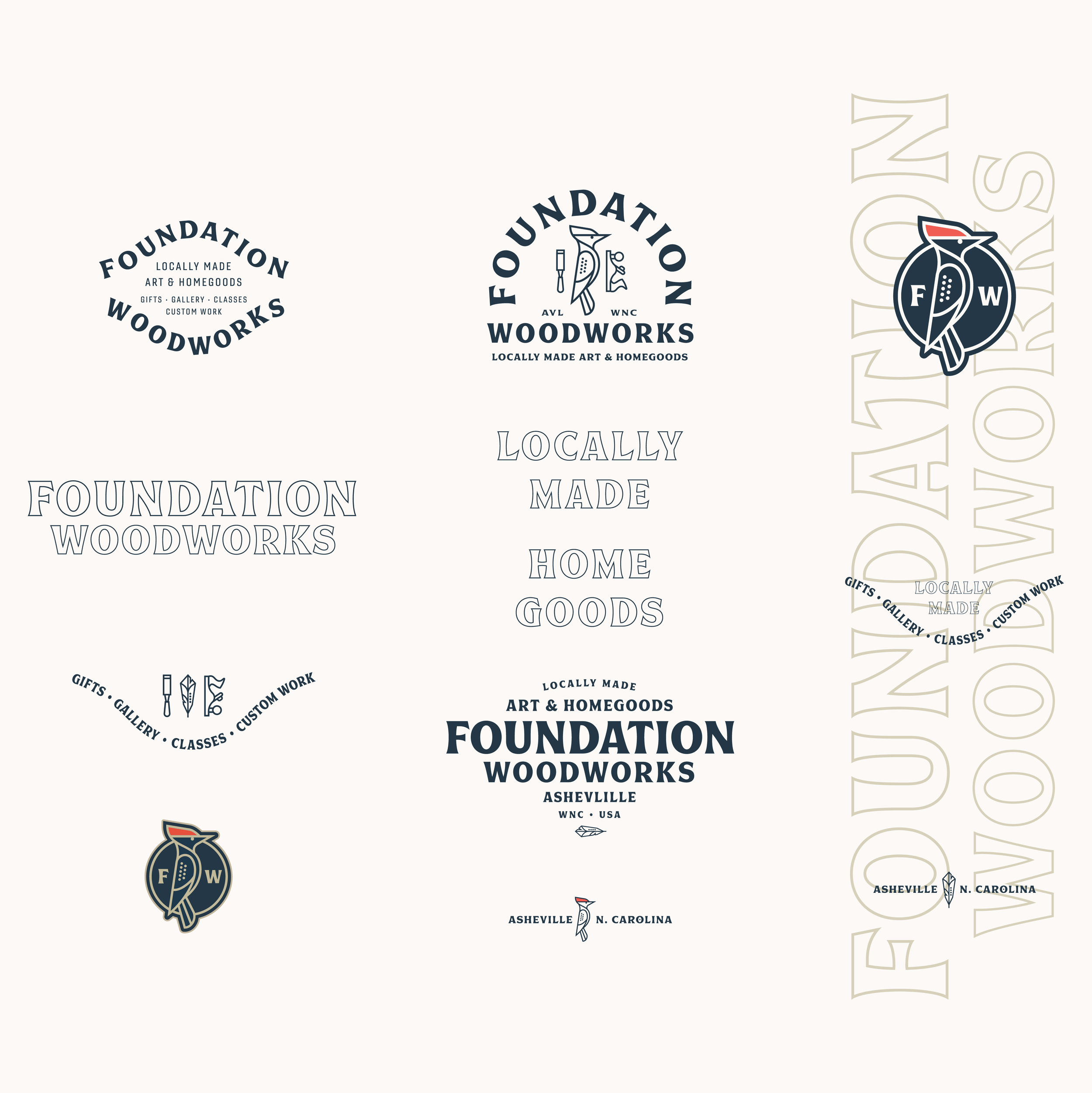
Project Scope:
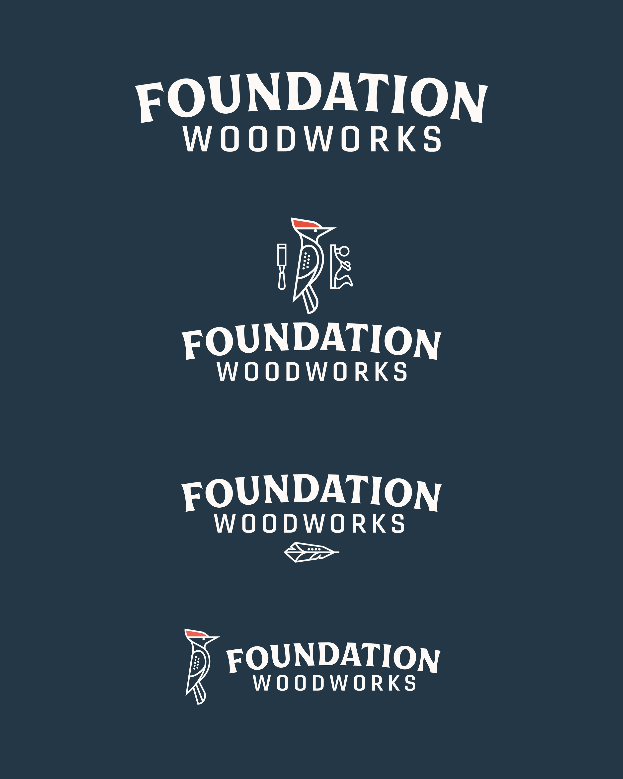
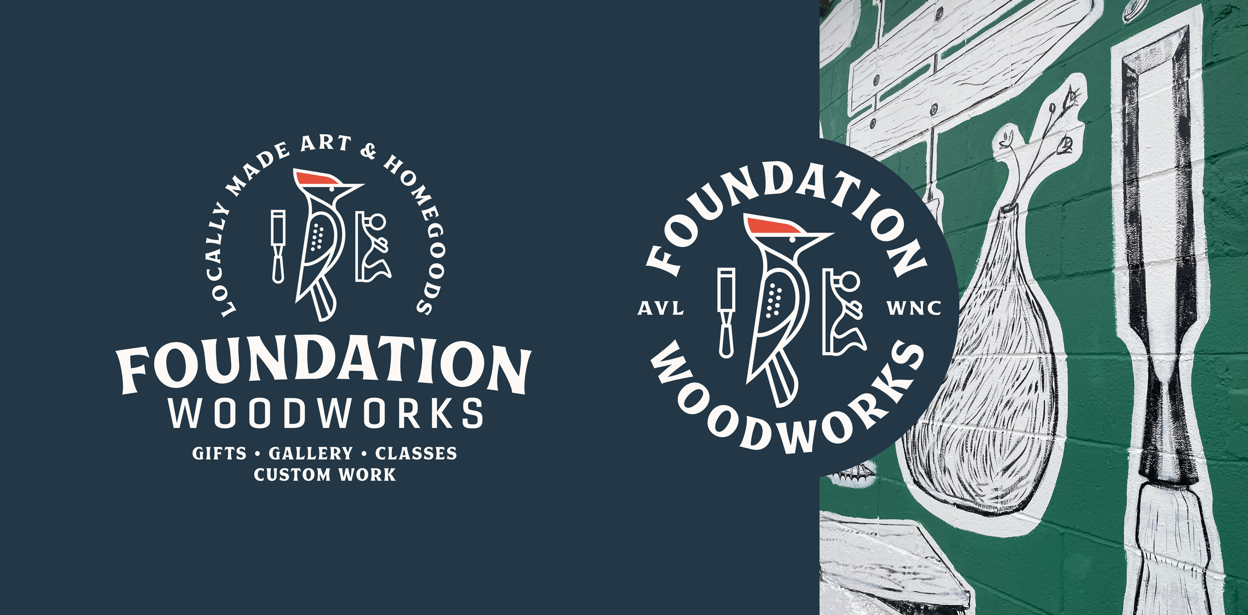
— Logo System
— Brand guidelines
— Type & color system
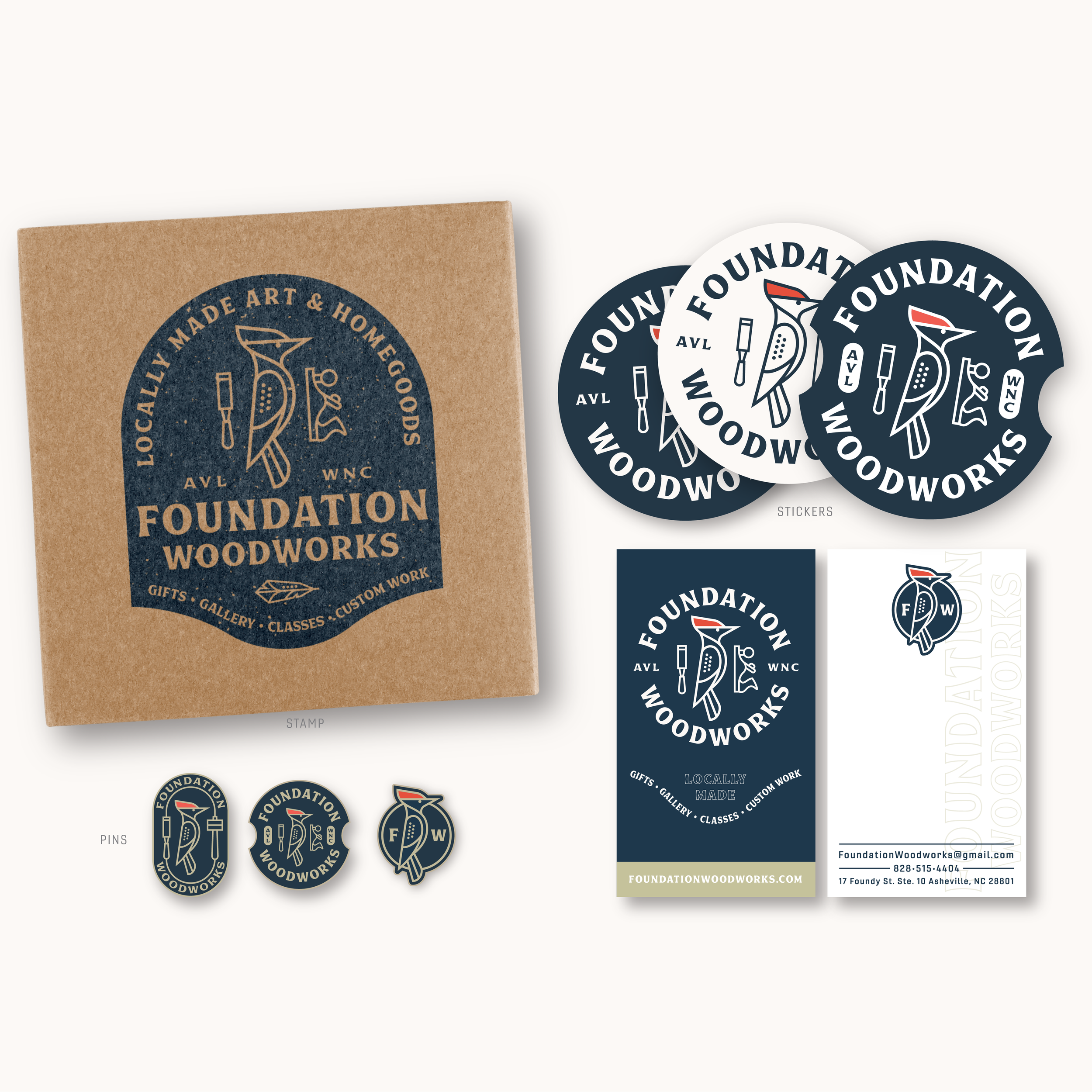
— Collateral: Labels, Stickers, Business Cards, Stamps
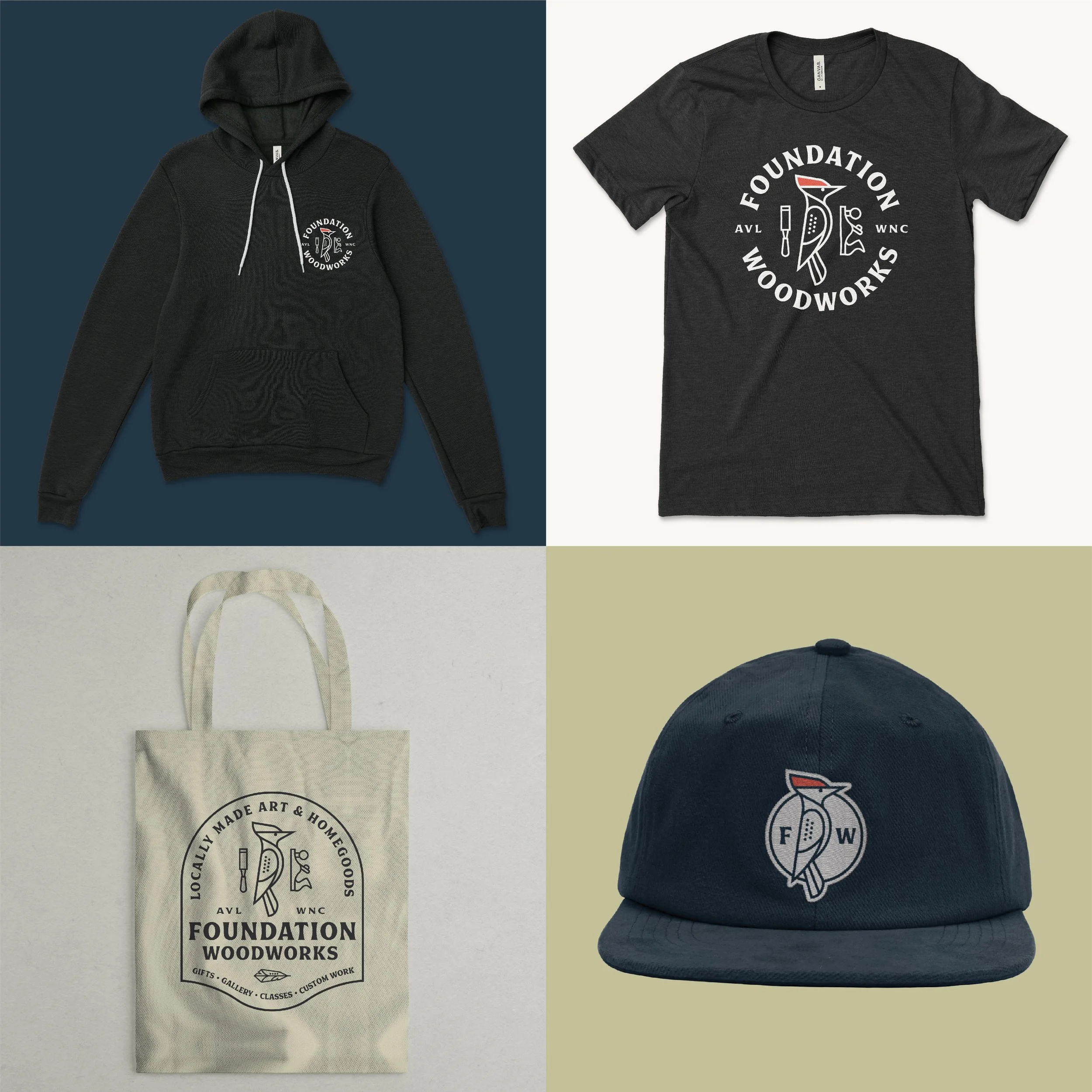
— Apparel / Merch
— Building signage design
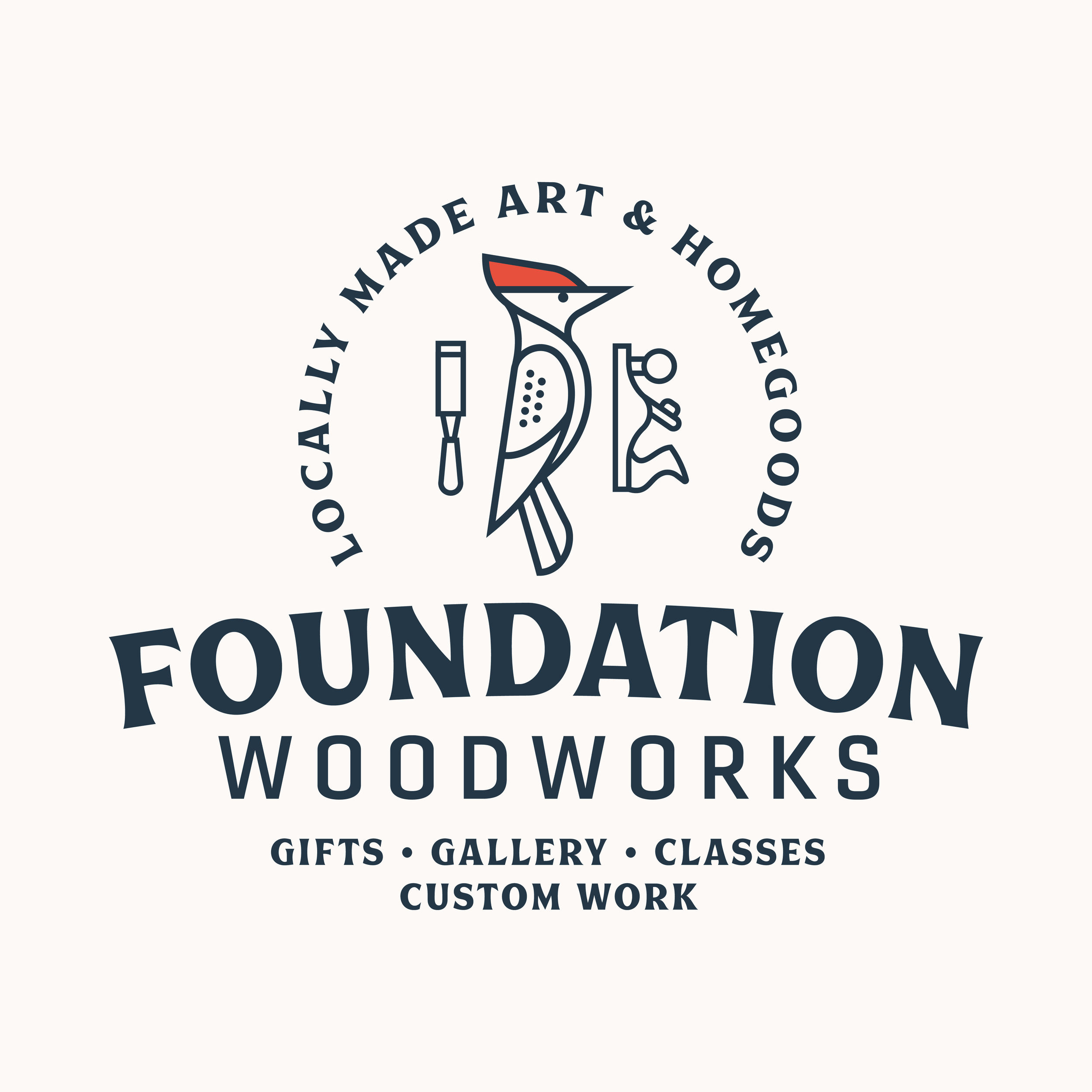
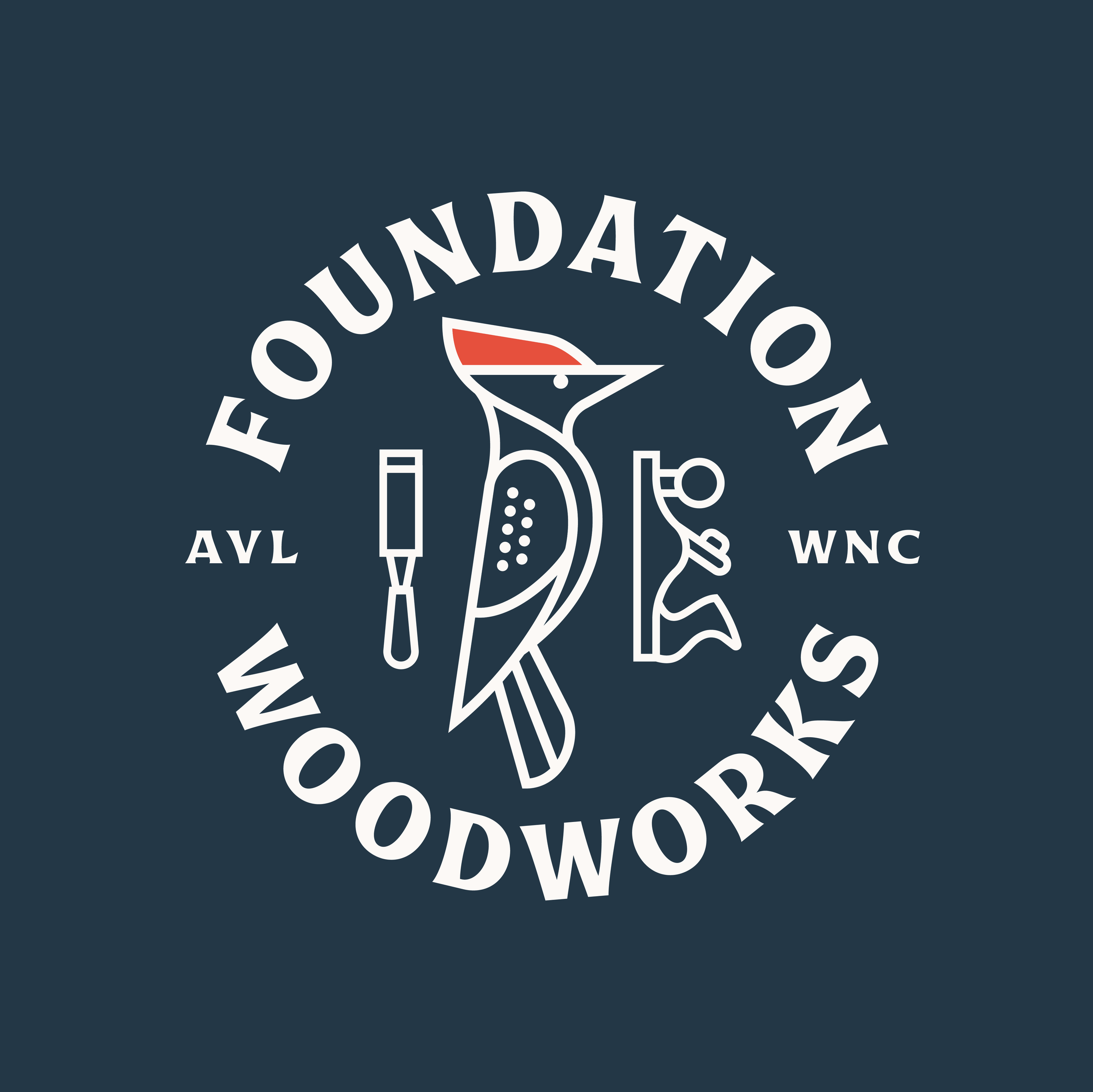

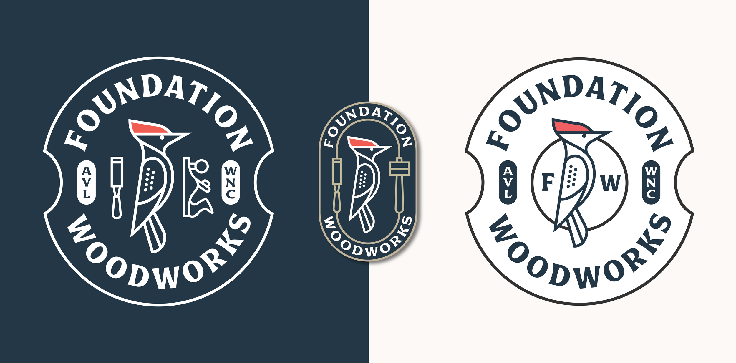

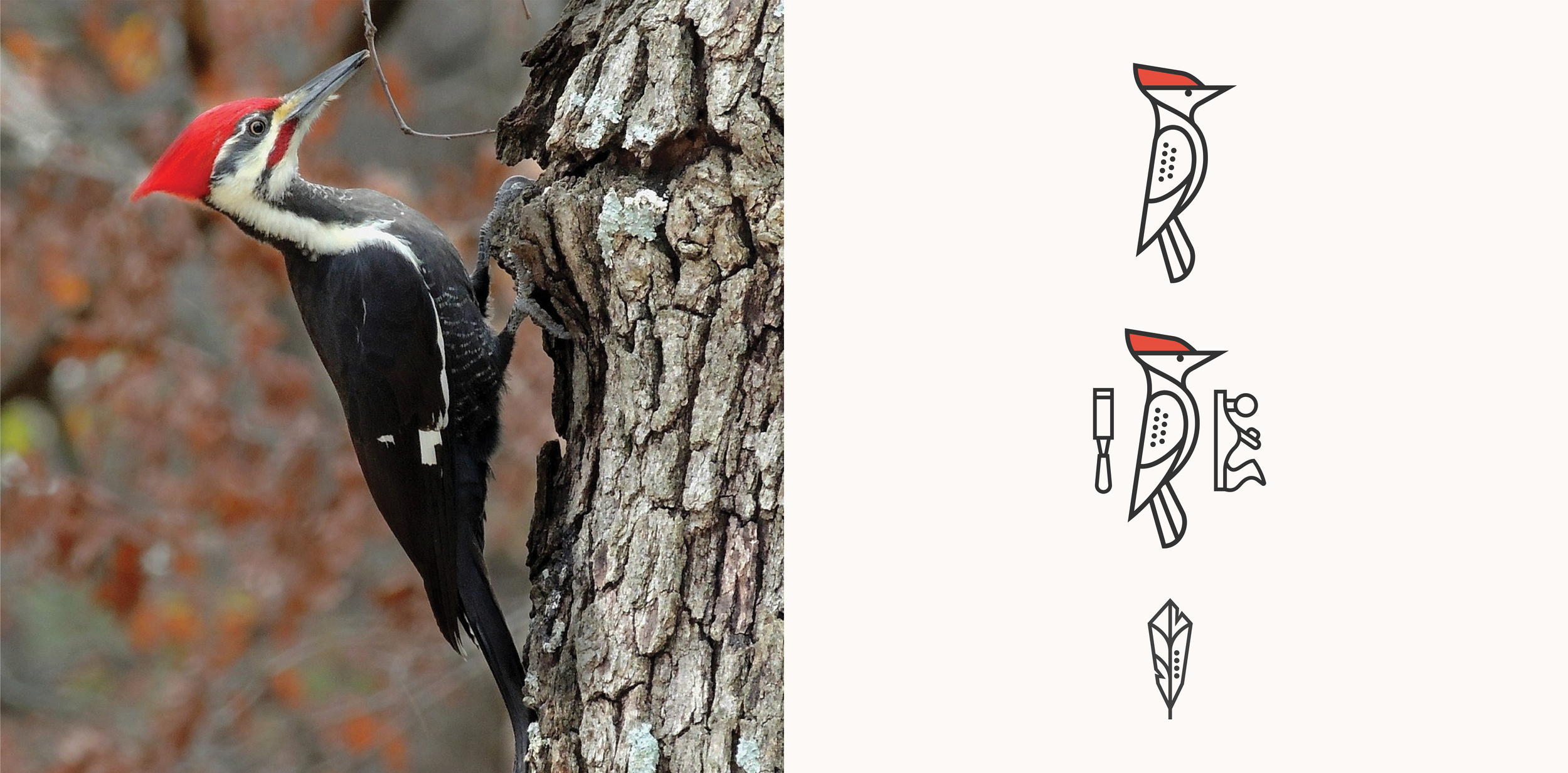
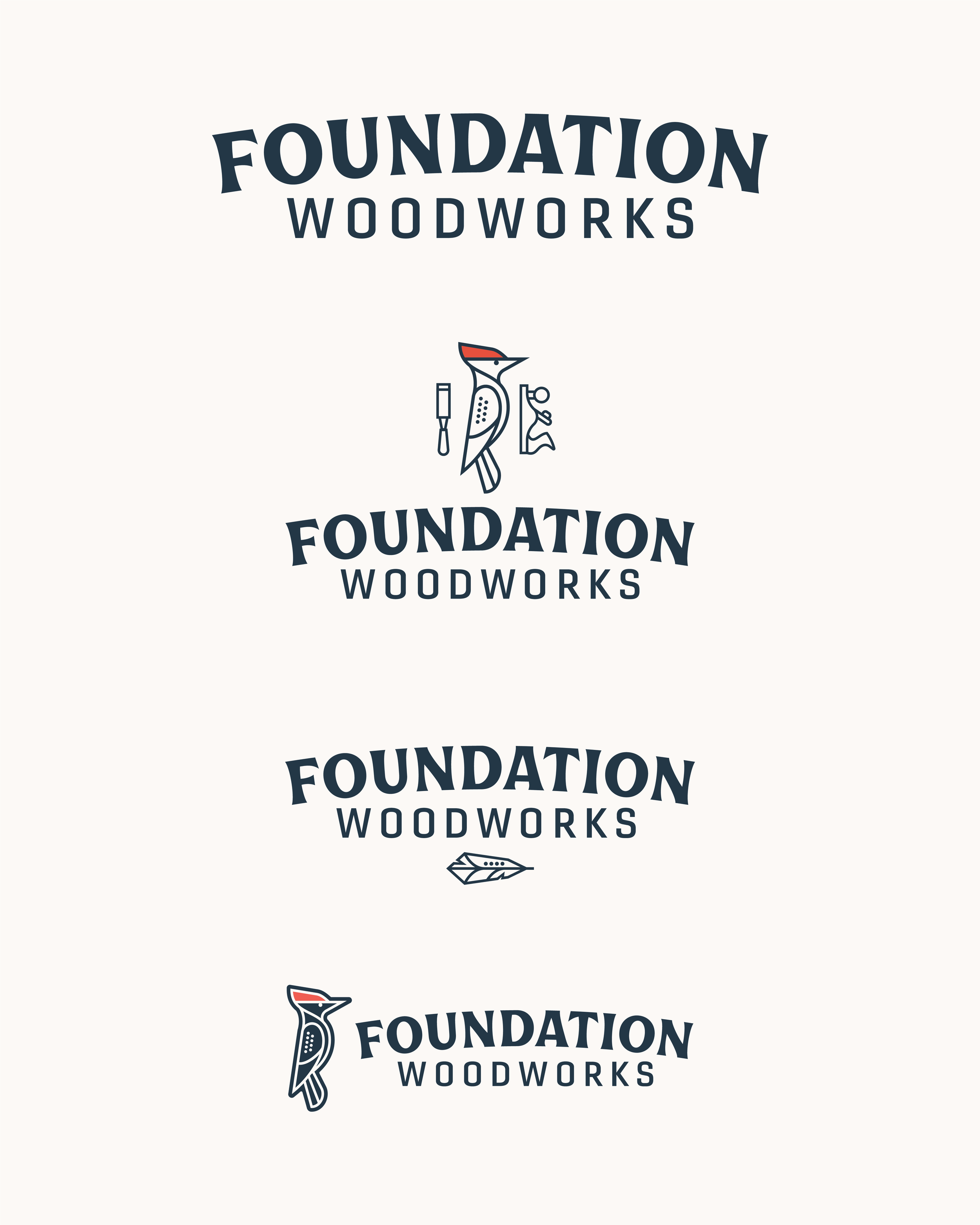
Behind the Logo
woodpecker
Elegant & Strong
Making the old new
Taking inspiration from an old woodpecker mural on the gallery we wanted to bring it back and make the old new. A woodpecker is elegant, strong and a perfect mascot for a woodworking co. We took that idea and ran with it combining old wood working tools and the woodpecker in a strong yet clean and simple style that has a playful and vintage touch. We wanted parts of this brand to feel like something you would find on an old Stanley tool.